
The day has finally arrived. United has been talking about its livery refresh for some time, and we know what it looks like. I have to say thanks to United for rolling it out yesterday, because I went on vacation last Friday and completely forgot to schedule a post for this morning. I’m back today, but this gave me some easy fodder. So here’s a somewhat-abbreviated post. Let’s start with the description of the look.

If there is one over-arching theme, it’s “blue.” The livery is now dominated by Rhapsody Blue, United Blue, and Sky Blue. The belly is painted Runway Gray, but that’s really a holdover from the old livery. The point here is that blue becomes much more prominent.
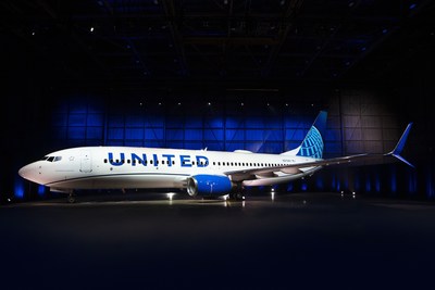
I’ve seen a fair bit of discussion about how disappointed people are, but why? United always said this was an evolution, not a revolution. Here’s what it looks like on the first airplane:
Are you underwhelmed? I suppose I am too, but I just have trouble caring all that much. I don’t have any particular issue with this refresh, but I just don’t know why it’s even worth doing.
It was a given that the logo and font would stay the same. If you change the font or logo, then you need to spend a ton of money on everything from business cards to bulkheads. That was never going to happen. So if the logo and font remain the same, then what changes?
First, the font gets bigger. Instead of sitting above the windows, the name now gets larger and bluer, and that makes sense. At the same time, United has adopted the swoopy cheatline that was already on the 787 and 737 MAX aircraft.
Other than that, the big change is that the gold color has been killed. Instead of a gold-tinged globe on the tail, it’s just all blue. Gold is nowhere to be found anywhere on the livery at all.
The final touch is a tagline near the first entry door on the left. Instead of “worldwide service” as on the old United, it will now say “Connecting people. Uniting the world.” Gimmicky? Maybe, but it’s pretty harmless.
This is a perfectly fine update, but I don’t know that it really changes anything. I still think United should come up with a new logo to help heal some of the merger wounds, but that is far more expensive and challenging, so it’s hard to fault the effort to simply update what’s already out there.
As far as updates go, this isn’t bad. It’s just also nothing special. I suppose that’s what United was actually aiming for. It’s certainly not offensive. Some will love it, others won’t. Many will be indifferent. But it’s a decent update to something that was getting fairly long in the tooth. I’m just not sure this is enough of an update to matter.
When it comes to liveries, employees care more than anyone. If this helps morale somehow, then great. It doesn’t need to inspire anyone on the outside. If this gets the employees excited, then it was worth doing.
69 responses to “United’s Livery Change is Barely Worth Mentioning, And That’s How United Wants It”
I actually like it, especially when compared to most livery changes. I love the United livery from the 70s / 80s, and this seems to inch them back in that direction . On a related note, I especially loathe the current American livery. Their classic design and logo that I grew up with was so iconic. They should bring it back.
Did those kids ever get off your lawn?
Yes they did. I take it you like American’s look?
I love AA’s current livery. It’s modern, colorful, and incorporating the flag on the tail looks amazing. It’s unfortunate that the quality of the airline doesn’t live up to its branding.
When I was your age, kids got off my lawn, uphill both ways…
B-o-r-i-n-g!!!!!! Really boring.
Losing the gold means United lost some of the richness and elegance in its look. That’s gone.
The manner in which the company is name is pained over the fuselage is little more than a direct rip-off of American’s look, which in turn is a rip-off of Pan Am’s last look. Face it, American beat them to the punch with it, so try something more distinguishing.
The best that can be said for the new look is that it beats the battleship gray look of the 1990s. At least for now.
I agree.
I need to see the livery in person, but from the photos I prefer the previous version.
Interesting that the new livery was rolled out on a 737 MAX. Just saying…..
That’s not a MAX, it’s a 737-800.
No, it’s a Max
UA Employee here
Mixed reviews internally. Some like it, some love it. some hate, some (like me) are indifferent. My only jaded comment is that with Kirby still around, creativity and innovation won’t be much of a priority. Those things, after all, cost money. And we know how Kirby feels about that…
Looks fine on a 737, but I’m wondering how this will look on larger aircraft. Seems a bit minimalist to me. I do like the tail better than the current iteration, though, even if it does scream “It may say United but we’re still really Continental.” Quite a contrast to American, which couldn’t wait to smear over their Useless Air aura.
I feel like there’s a Star Alliance playbook somewhere with a chapter entitled, “How to execute disappointing livery refreshes.” (e.g. Lufthansa). Your analysis is spot on – it’s not disappointment but it’s not inspiring. Given how other airlines have handled their livery refreshes, they could have done a lot worse.
Genuine question – what do you think is an example of an inspired livery refresh? I can’t think of any, in recent years.
Maybe Air Canada?
Totally fair question – out of all the Star Alliance carriers, Air New Zealand I think takes top honors for their livery refresh. As for intriguing liveries, I think Air Tahiti Nui did a good job as well. As for personal preference, I do think Austrian did a decent job on their refresh but it definitely doesn’t fit the inspiring bill.
Southwest when they dropped the brown for blue, yellow, and red?
Bobber – Well, not sure if you are trying to limit this specifically to “refresh” or including redesign as well, but I flew a few this week on my trip (much more to come on that) which I love.
*First up, Air Canada. Those Raccoon Eyes are amazing, and it looks professional. I actually liked the old mint color, but this looks better, especially in person.
*It’s a small one, but have you see Loganair’s look? It’s a stunner: https://photos.app.goo.gl/xphx8dRPs1SLX3tC7 *Air NZ is a great one too. I flew them home yesterday on the most beautiful of all, the All Blacks 777. But even the regular one looks excellent.
I didn’t fly them this week, but Pacific airlines have also don’t great work: Hawaiian, Air Tahiti Nui, Fiji.
Agree that the AZ Black is definitely smart (although I quite liked their previous livery) – not a fan of the psychedelic pacific schemes (although at least they are not dull). Did AC simply take the raccoon eyes from the 330/350s and put them across the fleet? If so, it goes to show what a little mascara will do…
Bobber – Indeeds, seems like that’s what they did. Here’s the A321.
https://photos.app.goo.gl/FcqL4mmojFKYkmSG9
LoganAir! Totally forgot about the Tartan. Great livery.
When I saw the Loganair photo, I thought that looks like something BA would have done during the World Tails era. Turns out, they did: https://commons.wikimedia.org/wiki/File:British_Airways_Boeing_737-436_Benyhone_Tartan_Wedelstaedt.jpg
Alaska new livery was pretty inspired, IMO.
Personally I prefer the gold globe and line they stood out, but then I never flew pre-merger.
The swooshy line is annoying (IDK who but someone calls it a GMST, Generic Meaningless Swooshy Thing), mainly because there is that little white gap between the grey and line AAAAAAAAAAAAAAHHHHHHHHHHHHHHHHHHHHHHHHHHHHHHHHHHHHHHH!
The blue engines don’t do it for me either, since they are under the Swoosh they should be gray maybe?
Finally Text over windows never looks good imho.
The first thought I had when I noticed the “swooshy line” is that it’s a map of the route through the plane for ejecting passengers who won’t allow themselves to be abused.
Maybe it’s the cynic in me and growing up post 9/11, but my general policy is:
“If cops come and tell you to do something and it’s not immoral, just obey them and sort it later”
The same applies to flight crew and airport personnel I spose.
Then again Dr. Dao did get a good settlement, so getting the drag could be profitable, hard choice.
The incident happened on Republic, involved no UA employees and the passenger was removed in accordance with the contract of carriage. Republic was 100% in the right. The passenger would lose court, which is why they settled for virtually nothing. Now you know.
Unless the livery change increases my seat width and pitch I could care less.
Less paint outside more room on the inside? Sounds like a slogan..
It’s ironic that you say that “They need to heal wounds from the merger” when the livery it replaced actually did just that: The blue/grey/gold livery when introduced by Continental bore no resemblance whatsoever to the gold/red/orange colors. And that was intentional and by design: as a visible, symbolic way to move past the agony from the Lorenzo years.
This update does nothing of the sort. Like you said. It’s an exercise in nothingness. In the context of “moving forward”, United really wasted this opportunity.
I know the vast majority of the public couldn’t care less about branding; the plane could be painted all white with nothing but the name painted in small black letters and no one would notice.
And what’s with the curved lines? Why is this industry so “monkey see, monkey do” like that? Where is the brand separation when everyone does it the same way?
I am not big on branding at all, and in fact in my industry I think retail branding is a total waste of money…
That said, United really had two iconic points of branding pre merger. If the Rhapsody in Blue isn’t the great American song, it is in the top 5. They had the sense to keep that (though my first few flights following the merger I did actually miss the old CO elevator music…).
The other was the tulip. They should find a way to bring back the tulip.
I think they should bring back the tulip by placing a small one next to the boarding door, similar to how SWA has a heart.
I think it looks better than the previous version of the Continental Globe. I thought the gold made it look dated. But, it’s still the boring Continental Globe. It does not say United, but rather Continental, which doesn’t exist anymore. The other sad thing is that this boring logo replaced not one, but two Saul Bass logos that were much, much better. If I was in charge, I would go out and find the next Saul Bass and have them design a new logo for me.
Of the big four airlines in this country, the only paint job I like is Delta’s. I think Southwest is weird, American’s looks like a child’s drawing, and United is masquerading as another company that no longer exists.
the logo is placed in the wrong direction on Delta’s tails. Absolutely the worst livery out there.
you know i’m the biggest cheerleader for UA here, and still when i saw that livery i fell into a deeper coma than Terri Schiavo.
Couldn’t you have just said “…I just fell into a coma”. What does a very depressing story of a woman on life support and the plug finally being pulled have to do with this paint job? Right, nothing. Have a little sensitivity.
Please, snowflake
Having some compassion for the victim does not make me a snowflake. What a stupid remark.
It’s your remark that was a waste of time. You’re complaining about a snarky comment that was not only NOT directed at you but has nothing to do with you. Anonymous virtue signaling does not make you cool nor does it impress anyone else. It’s annoying – go find something real to actually give some of your money, time, or compassion to.
As the old saying goes, “There’s no accounting for taste.” Some are going to like the new look; others, not so much. No livery is going to please everyone. I think this update is a good compromise (which is what it is). It emphasizes United’s blue while keeping Continental’s globe. Why change the livery now? I’m guessing the fleet is at the point where repainting almost all of it is necessary (which is probably all the time anyway), so a large percentage of the cost is already there.
My personal favorite is Nok Air’s livery. I love the bird’s beak on the nose. But as I wrote before, there’s no accounting for taste.
It’s fine. Probably a slight improvement. The biggest mistake was largely adopting the ugly Continental livery at the time of the merger, and abandoning the United tulip logo, which was iconic and elegant. The globe looks like cheesey clip art.
Interesting. The gold was a long lived element of the old Continental going back decades, when the gold was very prominently used on CO’s livery.
Seems like a clean cut from the past.
Reminds me too much of Jetblue now…
I have to agree.. if they want to get rid of the United+Continental image, then I’d say get rid of the globe and bring the Tulip back. If they want to keep it, I liked the golden globe better.
I understand they may be trying to build a new image going forward, but at the same time it’s destroying the image they built up in the past.
I think less is more, I love what United has done, I miss Kirby’s leadership…likewise we have Lufthansa flying into CLT with the 350 in its new paint…sharp, sophisticated, clean it’s absolutely beautiful…
Yeah, that isn’t really a compliment in my opinion. What LH did to their livery is a travesty. They went from bold and distinctive to drab and boring. I think it looks like the liveries of a dozen other airlines, which is terrible. As for UA’s new livery, it’s follow the leader without adding anything interesting. But it’s actually still better than what LH has done.
Just another dumbed down cheaper looking (Continental’s mentality) paint job. Much like warmed-up leftovers. When the windows shades are down, the UAL logo will not look right.
The oversized lettering seems to be a thing. Southwest, AA, and now United all have it. As someone who sees planes about 4 miles away from landing, you don’t notice the windows.
The new livery isn’t that great but not that bad either. As other mentioned, it is rather uninspiring. My main critique of this livery is that it seems that there is too much blue with the tail logo, not enough contrast. The new livery looks like JetBlue.
Queue up the merger speculation LOL LOL…I’m jk
I weirdly care about liveries a lot and I don’t work in the aviation industry. Contrary to pretty much everyone on aviation forums, I absolutely love the current American livery. I think it’s my favorite livery of any airline, worldwide. And I’m a Delta guy! I just love the AA livery for some reason, and always disliked their old one.
I think this United refresh is fine albeit nothing special, but I really think Delta is in need of a refresh. They’re the last airline to still put their name small above the windows.
If I were to do Delta, the first thing I would do is put the widget upright and red, white and blue like it was in the 70’s. The word Delta needs to be bigger. Then I would eliminate the blue belly and go with grey. The engines would remain blue with a hint of red. Yes, I love Eurowhite.
I find it odd that they put the tag line where nobody will see it unless they do ground level boarding. It should be to the right of the door so it can be seen during boarding.
How nice, they are trying to look like JetBlue so people will think UA at EWR is the same as B6 at JFK and maybe use EWR over JFK. Wonder if it will work?
It’s interesting that (at the time I’m writing this) you’ve gotten more responses on United’s livery than on jetBlue’s decision to fly to Europe.
Snowflakes don’t care (enough) about European flights…
I live in Chicago. JetBlue is irrelevant here. It’s a Boston/New York story and most of us don’t live there. The rest of us don’t care because JetBlue has done nothing to make us care.
I’ve said it before, and I’ll say it again… If you’re not within 100 miles of the ocean (or, even more specific, if you’re not within 100 miles of Long Island Sound, the Gulf / Caribbean, or the California coast), JetBlue basically doesn’t exist for you as a traveler.
Very sad, but very true
On top of the jetBlue and Ryanair comparisons out there, I also think it looks like the Indigo Partners airlines – Frontier, Jetsmart, Wizz, Volaris – with the white fuselage and brightly colored engines. It’s not ugly, but it looks like a LCC to me.
From First to Worst (Continental pre-merger to United’s new livery)
And dozens of other airlines’ liveries as these large corporations follow each other like lemmings, not daring to do anything bold. Not ever.
It’s fine but nothing really earth shattering and the use of numerous shades of blue begs for a bit more color somewhere else. The Continental globe is just fine, but if you’re going to go through the expense of repainting almost 800 jets, do something completely new. United has turned a corner but the brand is still very much maligned and synonymous with bad or indifferent service, delayed flights, and inconsistent service. This does nothing to lift United to another level.
For me, it’s “meh”. I like the new blue color palette, but frankly I am not a fan of modern liveries to begin with (basically logo on the tail, then blank body with HUGE lettering). Having the word UNITED in a capitalized, featureless, font sprawled across the fuselage is pretty monotonous and will probably look like dog vomit on a 777. The bingo ball stays, which is “meh”, and I don’t miss the gold as much as I would have expected. The blue engine cowlings seem simplistic, but I like the shade of blue they’re using there so it comes off pretty well.
On the whole, it’s kind of a yawn. I am a fan of the large cheat line concept of the past, and few modern liveries stack up to the classics. Case in point, check out the BOAC classic livery on that BA 747. Now THAT is a gorgeous livery.
I’m not really wowed by it, although it is growing on me some. I was personally relieved to not see the tulip come back, I am tired of hearing people talk about it.
Whenever I see United aircraft in the current look, I still see Continental Airlines, especially at the hubs where there are many planes. Maybe with the larger font and the bluer logo, people will see more of a United identity than a Continental identity.
I like it. Nice refresh while still looking professional. After seeing the FA uniforms UA has cooked up I think we should all be glad they didn’t try to be any more creative on this livery update.
Losing the gold makes the new livery look like something id expect to see on a budget carrier. Not impressed. Super dull refresh. I prefer the livery as executed on the UA 787s.
I actually hate this, and it is not because it is bland. Needless to say, there is way too much white and blue already on Star Alliance carriers…United, ANA, SAS, Lufthansa, Copa, Adria, Aegean, Egypt Air, and LOT. Can we get a little variety please, not just 50 shades of blue?
I mean, why not use this opportunity to try to set them apart? With TAM and Virgin America swallowed up, why not be the US-based jet that has a bold color? Maybe a more mature color palette like Singapore Airlines or something really bold with reds, oranges, and purples..something that blends corporate with cool…or something conservative but green (unusual in the US) – some elegant look to set themselves as being serious about improving their environmental footprint? United is competing with other legacy, full-service carriers who appear to be better at creating an image of themselves that make it clear they at least don’t WANT to look like a low-cost carriers like JetBlue and Southwest. The product “look” is almost indistinguishable now… Alaska approached the territory with its whimsical laundry detergent-looking livery already…this look is not exciting or inviting it’s…”fine”, barely.