
Earlier this week, Delta relaunched its homepage and you know what? They did a great job. It’s incredibly clean, very simple, and now we just have to wait for the design to make its way through the rest of the site. You know what’s most interesting? It’s very similar in idea to the one that Dustin Curtis designed for American Airlines awhile back that caused a big fight. At least Delta was listening.
First, take a look at the new Delta.com homepage:
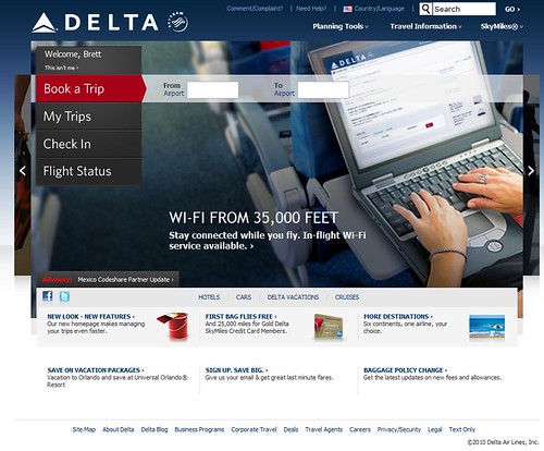
Forget about the background image which is kind of unnecessary (it pretty much disappears whenever you click on anything) and look at the pieces that Delta makes most prominent. On the left, there are five main categories: Your account (at top), Book a Trip, My Trips, Check In, and Flight Status. What else do you need? There are drop downs in the upper left for other areas which you might be interested in, but those are definitely not the main areas of focus. The airline has done a great job here.
What’s most interesting to me is how it resembles the Dustin Curtis-designed homepage for American. Dustin is just a guy who thought he could improve American’s homepage by making it easier to use, and he put this idea out there. When a contractor who worked for American wrote back explaining why things were the way they were, he was fired. AA.com hasn’t change. But take a look at this.

Remarkably similar, right? The first thing you see is Book Travel. Then the most prominent features at the bottom are Flight Status, Check-in, Your Account, and News. Ok, so Delta left off News and put in My Trips, but the idea is the same. Ease of navigation and finding what’s most important comes first. Great stuff.
Now, if you go to FlyerTalk, you’ll see a lot of angry people. Pages and pages of angry people. Sheesh, chill out. The number one comment? They just put lipstick on a pig. The rest of the site hasn’t changed. That is true, but Delta said in the blog post announcing the change:
We know our homepage looks quite a bit different from the rest of our site, but don’t worry, we’re working on that. Stay tuned in the coming months as we continue to update our site!
Great. They have to start somewhere, and the homepage is going to be the most visited page. Besides, the FlyerTalk crowd is full of power users, super elite members, etc. Most people who go to the website just want one of the big five things on the homepage. They’ll be thrilled.
My only complaint? I have a BlackBerry, and javascript sucks on a BlackBerry. So I’ll just have to stick to the mobile site, which admittedly is quite functional. But hey, that’s a minor complaint. Good job, Delta.