
In general, doing anything in the airline industry involves a high level of difficulty and complexity. But doing a brand refresh that most people will actually like? That’s at a whole different level. We’ve seen many airlines fail at that task, but if early reactions hold true, Alaska Airlines appears to have just done it.

Think back to the last few brand refreshes you’ve seen in the US. American’s new livery ditched the classic eagle logo and was controversial at best. United? People still mourn the loss of the iconic tulip. (Though I will say that the change from battleship gray to the lighter blue scheme more than a decade ago was well-received.) And then there’s Southwest, which had mixed reviews when it switched things up. (Though the airline refused to call that a re-branding.) The best an airline can hope for these days is that more people like the change than hate it.
I’m far from a branding expert, and there’s no question that I often think re-branding is a waste of money and time. But in some cases, I do see the value. Alaska is one of those cases.
Alaska has a very recognizable brand in its core markets. For the past several decades, people have associated Alaska with the Eskimo on the tail. Yet as Alaska expanded into Mexico and Hawai’i, many wondered if the Eskimo’s time had past. Many speculated that it was just a matter of time before the Eskimo went away and something more generic replaced him. That did not happen.
Instead, Alaska’s brand refresh went the opposite direction and further embraced the Eskimo with this great little mockumentary.
The airline rightfully saw value in its history, and it didn’t want to lose what it had built over so many years. But it wanted to fix the problems that it saw in its current design.
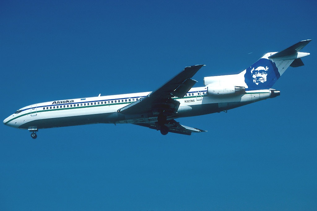
That Eskimo was designed in a different time, a time before the internet. That might not sound like it matters, but it does. In a blog post, Alaska explained “the Eskimo of the 1990s was too detailed to render well online and on mobile devices.” So it smoothed it out and simplified the design. It’s not noticeable from afar, but take a look here.

You can see the Eskimo was also lightened up. In fact, the whole design was lightened up. That’a reflection of the fact that focus groups showed the existing brand looked “corporate, functional and a bit cold.” (Cold? I mean, the name IS Alaska….) The only thing that loosened that up a little was the lei that was put around the Eskimo’s neck on 737s that had ETOPS certification. That little bit of color made a difference, but it also looked awkward.
The new colors introduce a lighter blue to complement the darker one. And the airline added what it calls “tropical green” to act as an accent. It’s funny because many years ago, before the current design, Alaska had a lighter blue and a green cheatline. What’s old is new again.
I’ve heard some people compare parts of the design to the dancing of the northern lights. I’ve also seen a lot of people compare it to the colors of the Seattle Seahawks football team. I may not like the Seahawks (at all), but I can see the value of using colors associated with one of the most important entities in Alaska’s most important market.
Beyond the colors, the font is changing as well. It’s a little strange since Alaska just updated its previous font a little. Now it’s changing again.

In the last update, the edges were softened a bit and the “k” stopping trying to pick a fight with the “a.” This time, most of the remaining hard edges were turned into curves and the serifs were removed.
This all comes together to create a highly recognizable but entirely more modern feel. On the aircraft, I do miss the cheatline running across the bottom of the fuselage. But there’s no question it looks more modern without it. The aircraft livery, however, is only a small part of the brand. And in reality, it’s not the part that people see the most. (Airline dorks excluded.)

People will spend far more time looking at airport counters, bag tags, credit cards, websites, etc. And all of that has been updated as part of this change. This isn’t just a livery. It’s an actual brand refresh. The airports will all be done by the end of this year. A fifth of the mainline aircraft will be done this year as well. It doesn’t say how long it’ll take for the rest of the fleet, including regionals, to be done.
The question, of course, is… does this matter? That’s a question for the ages. I didn’t understand why Southwest bothered changing its logo and livery. It seemed to me that the airline ditched the most recognizable aspects of its livery (the red bellies and the name on the tail) and unnecessarily replaced them. I like the addition of the heart logo, but that could have coexisted with the old livery. And the new font is non-descript and bland.
With Alaska, it’s clear that the airline is not trying to reinvent the wheel. The font and the Eskimo are an evolution that remain unique but feel more modern. Alaska has entered a lot of new markets over the last several years, including many in the eastern half of the country. It has also upgraded its product in many ways. So now, when Alaska pushes into uncharted territory, it has a brand that won’t look old, corporate, and cold. It’s modern, it’s clean, and it feels like something from the Pacific Northwest and Alaska.
I may not be a branding expert, but I really like what Alaska has done.
34 responses to “Alaska Updates Its Brand, And It Looks Really Good”
I agree with your final line, I also do really like what they’ve done with their brand. I’ve actually never flown with them (being Dutch, the chance is pretty slim I will in the near future), but for some reason I really like the company. They feel ‘honest’ and I always like the underdog.
There’s just one thing that I never understood: the way the A and L are aligned, I always think it says Allaska (so, with double L). Don’t know if they did it on purpose, but I find it a bit strange.
Nevertheless, it looks really awesome.
This is a Seattle based airline and also the Seahawks official airline. So it’s using the colors of the teams uniform. But the Seahawks always fly on a Delta charter, go figure….Glenn Perkins
Actually, Delta is the official airline of the Seahawks to which Alaska responded by hiring Russell Wilson to be its “Chief Football Officer”
Alaska is Not the official airline. They Only a have partnership with Russell Wilson
Given the size of the team and entourage I don’t think NFL teams usually fly with aircraft larger than what AS flies.
Midwest had sponsorships with Brewers, Bucks and Packers but never flew the Packers.
Ugh..that should say I *do* think NFL teams usually fly with aircraft larger than what AS flies.
I think NFL teams usually fly a 757 or a 767 sized plane. I flew on a flight to SFO that went back to St Louis as the Rams charters a few years ago and that was on a 757-300.
I think their best tail logo was years ago when they started service (I think) to Palm Springs and the Eskimo wore sunglasses.
Does the eskimo have a name and is it a real persons likeness?
Yep – fully story here: http://blog.alaskaair.com/alaska-airlines/who-is-the-eskimo/
It’s a really clean refresh and update. Very modern combination of colors, yet bold at the same time. Now, they’ll just need to update the uniforms so it’s not quite stuck in the 90’s.
ptachcha – Sounds like the uniforms are only getting minor changes. But I don’t know details.
I just hope this doesn’t mean the end of the lei. I liked the lei…
I think they want a fresher look to compete with the big boys. Nice to see them improving.
I feel that the “big boys” need to compete with Alaska in terms of service.
For sure!
As a loyal Alaska 75k flier, Alaska represents a service orientation that is real and genuine rather than the corporate talk without the walk of most legacy carriers. The brand update helps reinforce the unique elements Alaska offers from its heritage to its customer service focus to its continuous innovation and fierce independence. May Alaska continue to thrive with its updated brand. A brand cannot overcome poor performance, but in Alaska’s case the updated brand better reflects the strong performance. That’s why it works. BTW, Alaska’s green predates the Seahawks use of green (maybe the Seahawks copied it).
Agreed
I’m curious why they went to the expense and effort of the very minor updates to their logo and livery in December 2014. They painted a number aircraft with the new livery only to come out with this refreshed branding now. Very strange.
yea I agree because just about 80% of many fliers don’t care to much about what the paint scheme looks like they just care that there ticket is cheap the service is good that the plane will fly and get them to were they need to go without any problems. the rest well they make a big deal of schemes and things and I’ve known some that would not fly on a plane that had one paint scheme and reschedule and flight with another aircraft just so they can fly in the plane with there favorite paint scheme. oh and the differences of the big three and southwest is that all of them either acquired another airline or merged. Alaska has not done either (yet) so I feel that there situation I feel is quite different.
There is Jet America, but that was back in 1987..
Mike – that’s a great question. It seems odd since they had to have been going down this path by that time, I’d think.
I think the eskimo looks like a werewolf and is very scary.
Did they mention if they are changing the Horizon Air branding to match also?
Their FAQ says “Horizon Air will continue proudly flying for Alaska—and the Horizon–flown aircraft will feature the new livery design later in 2016.” The Horizon brand is pretty hidden from customers at this point, but I assume they’ll make a similar adjustment to the wordmark internally – not sure how much else is left there.
For what it’s worth they’ve updated the design of http://www.alaskaair.jobs but not http://www.horizonair.jobs
I like it. The Eskimo is Alaska Airlines like the widget is Delta and the animals are Frontier. Of course, after seeing AA’s horrid tail, no one can do worse than that monstrosity.
I’ve always thought that the Eskimo looked like Abraham Lincoln. Alaska was purchased by Lincoln’s secretary of state, after all.
I’m Alaska MVP and love the rebranding. The old one had seemed a bit stodgy to me for a while, and this respects the character and tradition while bringing it into this century. I usually hate this sort of bs market posturing, but for once, somebody got it right!
By the way, @planedoc I don’t care that Alaska’s not the cheapest sometimes. Their on-time performance, genuinely friendly and helpful staff at every turn, and clean/safe/well-equipped planes are worth a little extra for me.
Does the paint matter? Well, I’m a plane nerd, so I’d say at least a little bit, but what matters more is that the people who work for Alaska are glad to do so, and they treat the customers well as a result. A refreshed brand logo and new paint that people are proud of enhance those feelings of goodwill, so it probably IS a good investment.
The Seahawks may fly DL, but I will never depart SEA on their metal.
Thank you!
I really don’t get the hate of DL. AS and DL are still partners (kind of). I’ll fly AS when it makes more sense and I’ll fly DL when they make more sense.
One of the things that I think AS did right and the others have sort of mumbled through is they upgraded their in flight experience, and drove it toward a high level of consistency, then they rebranded. This might not be great from a financial perspective (Gotta put the planes in the hanger twice.) But from a brand delivery perspective its great.
Part of a brand is a promise, and they’ve delivered the major hard product bits before they rebranded, the ordering makes lots of sense.
One of the better-looking rebrands in a while. They kept the overall look and feel of the brand while simplifying the typeface and the graphic element of Charlie on the tail.
(Please come to SDF, Alaska! We’ll love you forever!)
I like the new look as well. What will be interesting to see is, as they repaint their planes, if they will keep the college-painted Q500s and the Portland Timbers 737 (Alaska Air is, after all, the official airline of the Timbers; when they returned home after winning the MLS cup, we all knew when they landed at PDX). Those are fun to see at the airports, and I hope they keep them.
Alaska kept the college planes when they dropped the Horizon name, so my guess is that they’ll do something similar – keep the design but change the font at some point…
As a self-admitted geek on such matters as airline branding & livery, I have to say that Alaska’s rebranding and new livery paint scheme is REALLY WELL DONE! The new colors and wordmark are fresh, modern and yet are still very recognizable as belonging to Alaska. The small tweaks to the Eskimo (including a slightly larger grin) won’t be very noticeable to most, but the slight changes accomplished what the airline set out to do in the first place.
I, for one, am happy Seattle-based Alaska chose to keep the iconic Eskimo on the tail. Although they’ve expanded their route system to include new cities in the Midwest and East Coast, and it would have been easy to drop it in favor of some generic tail design, keeping the Eskimo reminds everyone (old customers and new ones) that it is an airline proudly founded and based in the Pacific Northwest & Alaska. It also symbolizes a quality product and superior customer service reputation that the airline’s earned over the decades.
Well done, Alaska!