JetBlue Tweaks Its Colors While AirTran Unveils a Beauty (Airplane P*rn)

Airplane Porn, AirTran, JetBlue

Guess what time it is, kids? It’s airplane p*rn time! (Yes, that’s now with an asterisk to try to circumvent corporate filters.) You know how much I love airplane p*rn, and we’ve got two good ones this week with JetBlue and AirTran. Let’s start with JetBlue.

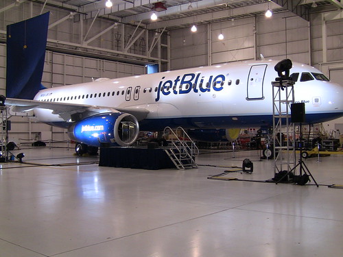
The buzz started last week that JetBlue would be rolling out a brand new livery for its whole fleet in celebration of the airline’s upcoming 10th anniversary. It turns out the hype was a little too much for what it actually was, and in my mind that’s a good thing. It wasn’t so much a new livery as it is a tweak on the old one. And really, what was wrong with the old one? Not much. But they made some good improvements. Take a look. First, they rolled out a new tail to add to their family of tails.

JetBlue livery reveal in Orlando

I like this one. The white on the tail makes it stand out, and it fits the brand very well. This will just be a new tail to add to the stable, so it will go on some airplanes, just like all the existing tails. But they also made changes to the rest of the airplane.

JetBlue new livery

Can’t tell the difference? Let me refresh your memory.

JetBlue's first Boston to Aruba flight touches down!

The changes are small. The little Jetblue titles are now much bigger and visible. Also, the two tone gray/blue title is now all blue. I think it makes the name more recognizable, and that’s good. Also, you’ll notice that the website on the engines has morphed from www.jetblue.com to jetblue.com and it’s bigger as well. So, not really any huge changes but they didn’t need them.

This is a good change. It will be rolled out very slowly. When planes go into the paint shop, they’ll get the tweaks (not necessarily the tail), so it will take awhile. And there will be more tails coming. An employee contest will be held to design a new one. Let’s just hope they do better than when America West let a kid design the Teamwork plane. That was awful.

But if you want to see a truly spectacular new livery, look no further than AirTran which has painted a 717 in the colors of the Atlanta Falcons. This thing looks like a rocket, and the new black fuselage is just awesome. It’s too bad this is only on a 717. That means we won’t see it out here in LA.

AirTran Sponsors Falcons (Nose)
AirTrans Sponsors Falcons (Tail)

AirTran sent me these pictures, but I have no idea why they didn’t send one of a full body shot. Click here to see a great shot from Mario Rodriguez of the airplane taking off (or should I say, launching).

Get Cranky in Your Inbox!

The airline industry moves fast. Sign up and get every Cranky post in your inbox for free.

31 comments on “JetBlue Tweaks Its Colors While AirTran Unveils a Beauty (Airplane P*rn)

  1. Personally, I liked America West’s kid designed “teamwork” plane a lot. Buit there’s no accounting for taste.

  2. Well ground controlers won’t like the AirTran plane at night since it will be hard to see in the dark, but it does look sharp. ‘Sharp’….did I age myself by using that word……lol

    When I saw the enlarge jetblue name photo my mind went right to Pan Am when they filled the side of the plane with their name. Was that the begining of the end when they did that?

    To this day I still like the multi color planes of Braniff and the great bright ‘yellow banana’ planes of Hughes Air West.

  3. AirTran likely could not send any side-on pics because the ramp area outside the Miami facility where it was painted was too crowded and near fences to get any decent side shots.

    My photo was taken on takeoff from Orlando on it’s first day of service after being painted, second leg of the day. The unveiling wasn’t until a day later so they might have to rushed it into service.

    With all the fanfare about a JetBlue paintscheme that still looks plain (and in my opinion) didn’t do anything to make the plain livery any more exciting, the boldness of the AirTran Falcons plane more than made up for this. It should be something cool to see around while it lasts.

  4. Speaking of plane changes, did you see the news out of Hawaii? Mesa and Republic will form a joint venture and merge the Mokulele and go! routes with the E170’s returning to Republic’s mainland operation.

    This should have Hawaiian messing their pants, now they will have to compete with only one stronger low cost airline. Should be interesting.

    Sorry for getting off the B6/FL topic of the blog.

  5. Simon wrote:

    From the front the airTran one looks like the A-Team van. I ain’t goin’ on no airplane, fool.

    The fact that BA was afraid to fly makes it even that much funnier. I would love to see an A-Team airplane.

    David SFeastbay wrote:

    When I saw the enlarge jetblue name photo my mind went right to Pan Am when they filled the side of the plane with their name. Was that the begining of the end when they did that?

    I think it’s safe to say that there is no correlation between airline success and the use of billboard titles vs smaller titles.

    To this day I still like the multi color planes of Braniff and the great bright ‘yellow banana’ planes of Hughes Air West.

    Amen.

    Mario R. Rodriguez wrote:

    With all the fanfare about a JetBlue paintscheme that still looks plain (and in my opinion) didn’t do anything to make the plain livery any more exciting, the boldness of the AirTran Falcons plane more than made up for this. It should be something cool to see around while it lasts.

    Thanks for chiming in, Mario, and for getting that shot of the Falcon plane. I think the problem with the JetBlue livery is that it was hyped up too much. I liked their old colors and I think this is a nice little improvement that doesn’t stray from the brand at all.

    David SFeastbay wrote:

    Speaking of plane changes, did you see the news out of Hawaii?

    Aye, aye. I actually wrote about this on BNET today:
    http://industry.bnet.com/travel/10003782/mokulele-and-go-join-forces-to-cut-capacity-in-hawaii/

  6. Looking at that AirTran plane, it makes me wonder why airlines haven’t sold naming/paint scheme rights on airplanes to generate cash. Turn them into giant flying brand billboards.

    Yes, I realize that’s gaudy and horrible — I love airplane livery graphics too. I’m not suggesting it as a good idea. But considering the financial state of the industry, and how they continue to come up with more and more complex fee structures and ways to squeeze out a dollar here and there, I’m surprised this hasn’t already happened.

  7. The only thing I don’t like about the B6 paint is the R trademark symbol after the titles. Really? Is that necessary?

    I heard FL has Ravens and Colts planes coming soon. If true, that’s worth the hype!

  8. Andrew wrote:

    Looking at that AirTran plane, it makes me wonder why airlines haven’t sold naming/paint scheme rights on airplanes to generate cash.

    Some have. Western Pacific was one of the pioneers in this regard. The legendary Simpsons plane was possibly the best one I’ve ever seen. Skybus also tried to do this, but only sold one to Nationwide Insurance. In Europe, it’s more common.

    Ken wrote:

    The only thing I don’t like about the B6 paint is the R trademark symbol after the titles. Really? Is that necessary?
    I heard FL has Ravens and Colts planes coming soon. If true, that’s worth the hype!

    In a way I agree about the R being annoying, but on the other hand, it really does symbolize how strongly JetBlue cares for its brand.

    I’ve heard the same thing. I can see the Ravens plane looking absolutely amazing, if they do it like this. The Colts plane? Well if they make the fuselage blue, it would be pretty cool.

  9. The HP Teamwork plane was known colloquially to airline/airplane geeks as “Romper Room.” OK, maybe amongst the older airline/airplane geeks.

  10. I like both the liveries, but the JetBlue one looks like it could’ve had a better alignment on the windows. They just cut out the cross bars too much.

    And CF, I’m sure the kids AW plane was a revenue management decision that your department originated.. :-p

  11. Gotta say–that AirTran bird looks sharp, but it would look much sharper without that ugly Falcons logo plastered all over it ;-).

  12. The Falcons jet looks like the A-Team van, well if it was a 717. I’m probably dating myself with that reference.

  13. CF David SFeastbay wrote:
    Speaking of plane changes, did you see the news out of Hawaii?
    Aye, aye. I actually wrote about this on BNET today:
    http://industry.bnet.com/travel/10003782/mokulele-and-go-join-forces-to-cut-capacity-in-hawaii/

    I just read your write up on BNET and was wondering if you know if it was ever said why they named it go!. Doesn’t sound very hawaiianish which you would think it would be. I thought I read where the locals didn’t like the name.

  14. David SFeastbay wrote:

    I just read your write up on BNET and was wondering if you know if it was ever said why they named it go!. Doesn’t sound very hawaiianish which you would think it would be. I thought I read where the locals didn’t like the name.

    I don’t know where the name came from, but it wasn’t the name the locals hated. It was Mesa and their tactics that angered a lot of people.

  15. regarding the Falcons plane —

    It’s true that airlines avoid dark colored paint because it weighs more, right? I’ve always been curious to know how much difference it would actually make (every time I think about the AA lack of body paint) — seems like this is an interesting opportunity to compare the fuel consumption of the Falcons plane vs. typical AirTran 717 and see what the difference might actually be. Would also be interesting to know how much that black paint might contribute to AC needs on the tarmac. (sorry if these are stupid thoughts — I’m nowhere near the league of your regular commentors!)

  16. Oh and I completely agree that the location of the logo on that JetBlue plane is very awkward w.r.t. window location. Ugh — misfire on the designer’s part.

  17. myriam wrote:

    It’s true that airlines avoid dark colored paint because it weighs more, right? I’ve always been curious to know how much difference it would actually make (every time I think about the AA lack of body paint) . . . Would also be interesting to know how much that black paint might contribute to AC needs on the tarmac. (sorry if these are stupid thoughts — I’m nowhere near the league of your regular commentors!)

    First of all, these are NOT stupid thoughts at all. I’d encourage anyone who is thinking about commenting to do it, because you have nothing to lose. (I mean, nobody will no who you are anyway.)

    Now, back to your points. I don’t believe there is any difference in weight between light and dark paint. There may very well be a cost difference for more exotic colors, but this is definitely out of my area of expertise.

    Paint in general does weight more than no paint, but I’ve heard that it’s really a wash in terms of ultimate costs. Pain provides a nice protective layer for the skin of the airplane, so without paint, there are additional costs to keeping the skin protected from the elements. There is a fuel savings to having no paint, but I’ve always understood the total benefit to be nil.

    Your point about air conditioning costs is actually a huge one. That was one of the main considerations when US Airways introduced its new white logo. The old US Airways spent a lot of time in cold weather places, but the new US Airways has a substantial operation in Phoenix and Vegas. So, they wanted a lighter livery to keep the planes cooler.

  18. Dig the blue bubbles on Jet Blue!

    As for the AWA Teamwork plane designed by the kid…we used to call it “Nightmare on Sesame Street”, just awful. If we had done our Mexico themed plane, it would have been real sweet.

    For a really nice livery, check out the Surinam Airlines 747-300, beautiful, but very soon it will be gone.

  19. Ever since I’ve worked for AirTran, theyve only painted/stuck decals on 717s. I wonder if its cheaper? I wouldnt mind seeing a 737 done up nicely myself one day!

  20. Ah, thanks, Cranky. fwiw, I got that “dark colors weigh more” thing from the tour guide at the Boeing 747 plant — not necessarily a reliable source, but hopefully. Good to know about the A/C — having been the owner of a white car and a dark blue car in southern california I can definitely relate.

  21. beautiful look for a likable and profitable airline for a change. aren’t they the only profitable one now since southwest turned a huge 3rd qrtr loss on fuel hedging?

  22. sunil wrote:

    beautiful look for a likable and profitable airline for a change. aren’t they the only profitable one now since southwest turned a huge 3rd qrtr loss on fuel hedging?

    Both JetBlue and AirTran were profitable, but there are others as well. Allegiant, for example, and Alaska as well both posted pretty strong profits. By the way, I would hardly call Southwest’s $16 million loss “huge.” It was actually quite small.

  23. I saw that Falcons jet last week. I can’t remember which airport though. (I was in several). I think it was LGA or IAD. It was landing as we were taxiing on the runway. Looked pretty sweet to me!

Leave a Reply

Your email address will not be published. Required fields are marked *

This site uses Akismet to reduce spam. Learn how your comment data is processed.

Cranky Flier